The Accessibility Challenge on Data Screens
Enterprise dashboards and research evidence displays often present multi-column layouts, data badges, and status indicators within dense user interfaces. When visual design choices focus exclusively on layout compacting, low visual contrast and rigid container dimensions can render evidence unreadable for users with visual impairments or those who rely on screen zoom controls.
Web Content Accessibility Guidelines (WCAG) 2.2 defines informative guidance and normative criteria to ensure visual interfaces remain accessible [S1] [S2]. Success Criterion 1.4.3 addresses minimum visual contrast [S1], while Success Criterion 1.4.4 requires text resizing up to 200 percent [S2]. This document proposes a manual verification protocol for testing evidence screen components against these criteria without claiming full platform accessibility certification.
WCAG 2.2 SC 1.4.3 Contrast Minimum Requirements
Success Criterion 1.4.3 mandates that the visual presentation of text and images of text maintain a contrast ratio of at least 4.5:1 against surrounding background colors, with specific normative exceptions [S1]. For large-scale text—defined as at least 18 point or 14 point bold—the minimum contrast ratio requirement is 3.0:1 [S1]. Exceptions include text in inactive controls, purely decorative or otherwise incidental text as defined by the criterion, and logotypes [S1].
To illustrate this requirement, consider two synthetic color pairs evaluated on a research panel. Standard metadata text rendered in dark gray #475569 against a light background #F8FAFC achieves a contrast ratio of approximately 7.24:1, passing SC 1.4.3 [S1]. Conversely, status text rendered in light blue #60A5FA against a white background #FFFFFF yields a contrast ratio of approximately 2.54:1, failing SC 1.4.3 [S1]. Design systems must evaluate foreground and background colors in all state variants.
WCAG 2.2 SC 1.4.4 Resize Text Mechanics
Success Criterion 1.4.4 requires that text can be resized up to 200 percent without assistive technology and without loss of content or functionality [S2]. The normative text excludes captions and images of text from this requirement [S2]. The core operational goal is ensuring that users scaling browser text settings can read all content without text clipping or overlapping elements.
Distinguishing text resize from full page reflow is essential during UI testing. SC 1.4.4 concerns text enlargement; full-page browser zoom can be a sufficient method, while text-only resizing is also a useful diagnostic check [S2]. A common failure occurs when fixed pixel heights (such as height: 30px; overflow: hidden;) are applied to text containers, causing scaled text lines to be truncated. Relative units can contribute to an adaptable design, but a passing result also depends on container sizing, wrapping, overflow and the complete component behavior [S2].
Proposed Evidence Panel Verification Procedure
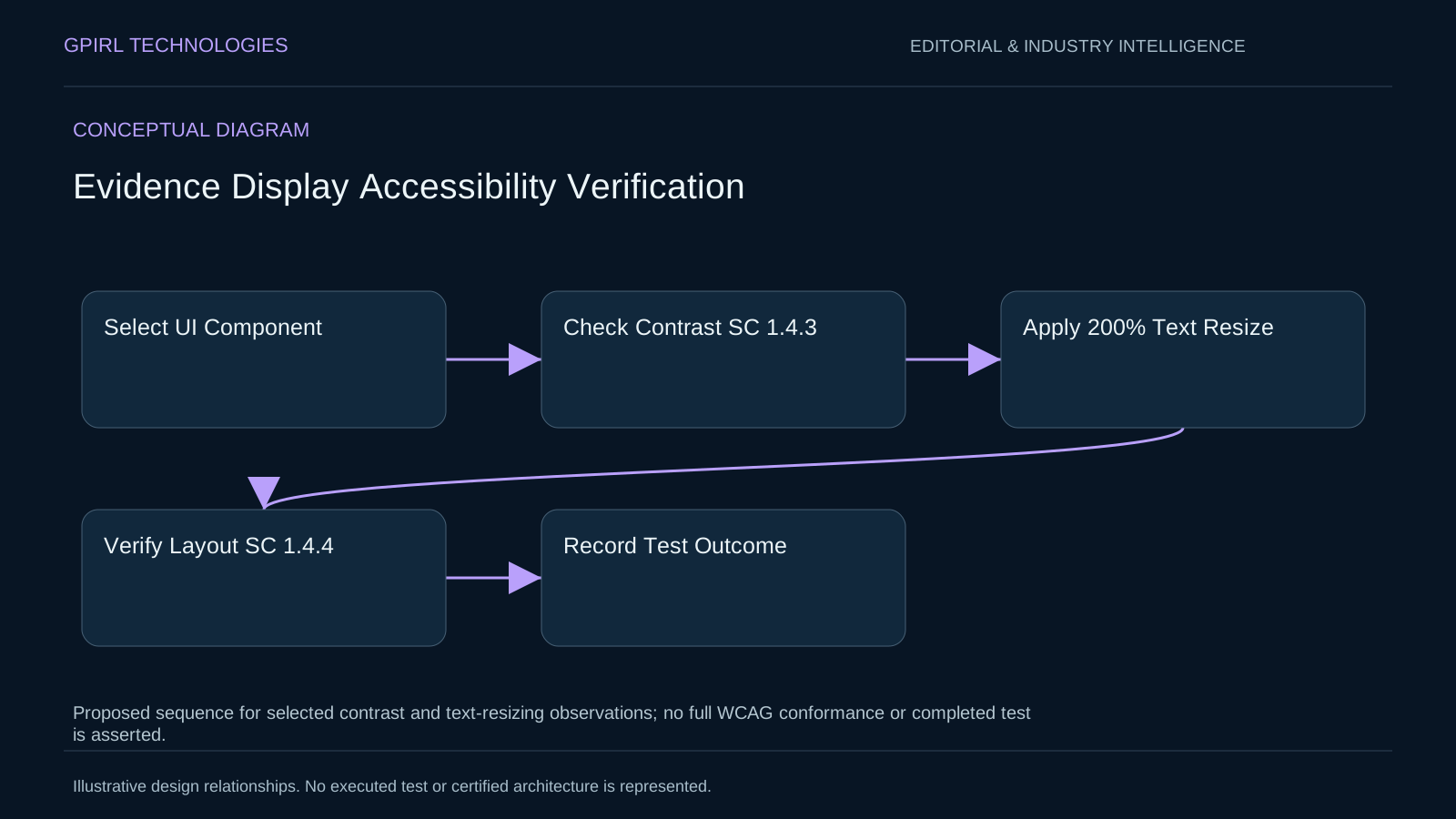
The proposed GPIRL Labs verification protocol outlines a structured manual review process for testing evidence UI components. Step one isolates the target evidence screen within a standard web browser environment. Step two samples color hex values across primary text, secondary metadata, and badge components, calculating contrast ratios against actual background colors to verify SC 1.4.3 compliance [S1].
Step three applies 200 percent text magnification using browser font controls. Step four inspects all evidence cards, table rows, and citation panels for visual clipping, text truncation, or overlapping container boundaries to verify SC 1.4.4 compliance [S2]. Step five logs all pass, fail, or conditional results in a standardized review template.
Synthetic Pass and Fail Case Studies
Evaluating synthetic evidence card designs demonstrates how layout choices impact compliance. In Case A, an evidence component uses fluid flexbox containers with min-height and relative padding. Assume its colors have a calculated 5.0:1 ratio. If an actual browser test then shows unclipped text and retained functionality at twice the original text size, that state would pass these two isolated checks. This is a hypothetical expected outcome, not an executed GPIRL test [S1] [S2].
In Case B, an evidence badge applies a fixed CSS height of 24px with light gray text on a white background. Suppose a tested state clips text at twice its original size and its selected colors calculate to 2.8:1. Under those explicit assumptions, normal-sized text would fail the contrast check and the clipping would fail the resizing check. These are illustrative conditions rather than measured product results [S1] [S2]. Correcting Case B requires removing fixed height constraints and adjusting color parameters.
Decision Records: Designing Adaptable Layouts
UI design teams balancing visual density with accessibility must record explicit layout decisions. Designing tightly packed tables with fixed dimensions preserves screen real estate but increases accessibility failure risks during text scaling. Transitioning to responsive design patterns allows layouts to accommodate text scaling gracefully.
An architectural decision record for an enterprise component library might mandate that all text containers use relative units (rem) and auto-expanding vertical flexbox layouts. This design decision prioritizes SC 1.4.4 compliance and text readability over rigid pixel-perfect vertical alignment [S2]. The proposal still needs to be tested in the supported browsers and component states; choosing relative units alone is not a conformance result.
Tradeoffs, Limitations, and Testing Constraints
Implementing adaptable text containers involves layout tradeoffs. Allowing containers to expand vertically during text scaling can alter multi-column dashboard alignments, pushing secondary widgets below the fold. Designers must balance content hierarchy with flexible sizing to maintain visual balance.
Furthermore, manual contrast and text resize testing evaluates specific component states rather than full WCAG 2.2 conformance. This proposed protocol does not constitute formal accessibility audit certification or a guarantee of universal compliance across all browser environments. It serves as a practical internal review framework for identifying visual accessibility defects early.
Practical Testing Guidance for Design Teams
Design and development teams building research interfaces should integrate contrast and text scaling checks into component review workflows. Step one requires auditing design system color tokens against SC 1.4.3 contrast minimums before coding [S1]. Step two enforces the use of relative CSS units for typography and container padding.
Step three performs manual 200 percent text zoom checks in staging environments to verify SC 1.4.4 compliance [S2]. Step four documents component testing outcomes in design system records. These manual checks can identify defects in the tested states. They cover only selected criteria and do not establish accessibility for every user or full WCAG conformance.
Proposed Test-Case Matrix for Evidence-Screen States
To evaluate interface readability and scaling behavior across complex UI states without claiming formal platform accessibility certification, teams can utilize a structured test-case matrix. Consider a fictional research evidence panel containing a long translated source label, active and inactive toggle controls, keyboard focus and mouse hover validation states, and a prominent error banner. The review framework compares text-only resizing against full-page browser zoom as locally selected methods for evaluating visual adaptation. Participants examine how each scaling method interacts with container boundaries, noting that evaluating contrast ratios and 200 percent text resizing does not constitute complete WCAG conformance verification.
The test matrix investigates the assumption that visual contrast depends solely on design token names rather than actual rendered foreground and background color states. During the review, participants evaluate edge cases where semi-transparent overlays or dynamic theme shifts alter effective contrast ratios. Reviewers record observations at selected viewport resolutions, noting whether long translated strings wrap cleanly or cause text truncation within fixed-width UI containers. The exercise emphasizes manual meaning review, requiring participants to assess whether scaled text retains its instructional clarity and operational context without relying on automated pass-fail tool outputs.
The evaluation documents assumed input states, identified styling bottlenecks, and unknown outcomes regarding rare browser rendering engine behaviors. The resulting documentation explicitly clarifies that no proprietary GPIRL software features or production interfaces are tested or guaranteed during this review. Reviewers record alternative layout strategies, such as fluid CSS grid templates, comparing their performance against traditional fixed-dimension designs. By structuring the review around a comprehensive test-case matrix, design teams identify potential usability barriers and refine component specifications, leaving actual usability and conformance outcomes open to testing.
This is an unexecuted design exercise. The assumed inputs support illustration and arithmetic only; no facility measurements, deployed interface results or operational outcomes are reported.
Official background videos
External publisher context. These recordings do not demonstrate GPIRL products or validate the proposed designs.
- W3C WAI: Colors with Good Contrast
Official W3C video page illustrating the human impact of contrast. It is background context, not a completed assessment of this proposed test or evidence of WCAG conformance.
Sources and further reading
- [S1] W3C WCAG 2.2 Understanding Success Criterion 1.4.3: Contrast (Minimum)
- [S2] W3C WCAG 2.2 Understanding Success Criterion 1.4.4: Resize Text
References do not imply product certification or endorsement.
Have a related operational question? Discuss the evidence and review questions in your operating context with GPIRL Technologies.